Level Up Your Note-Taking with LLMs
October 09, 2025

Data Visualization: More Than Just The Graph
Who doesn’t love a good bar chart? Charts can be a powerful tool to help us tell a story, sometimes far more effectively than a paragraph of text.
In the world of analytics, data visualization is a key skill that must be used carefully and effectively by analysts to tell the intended story. More than just the tool chosen to create the illustration, a good chart or graphic is developed by a sharp analyst who understands the audience and stays focused on the intended story.
What’s the difference between telling your story in a table vs. a graph?
Text
- Offers great precision
- Slows the reader down
- Easier to look up information
Graphics
- Gives shape to number
- Show patterns that are hidden in the numbers
- Good graphics are engaging and stimulate creative thinking
- Harder to create vs. a table
I’m a big fan of graphics, there is both elegance and power in a well-designed graph or two. Text and tables are great for detailed reports, but in most channels, an effective graphic is better. Designed well, it can quickly deliver the message and context necessary to reinforce the story for your audience.
How do you recognize a good graph? One way is to read Cole Nussbaumer Knaflic’s blog via http://www.storytellingwithdata.com/. In addition to her blog, Cole offers both public and private workshops, has written a book (which is on my to-read list) and has assembled a compelling gallery on her website to illustrate the power of a good graphic.
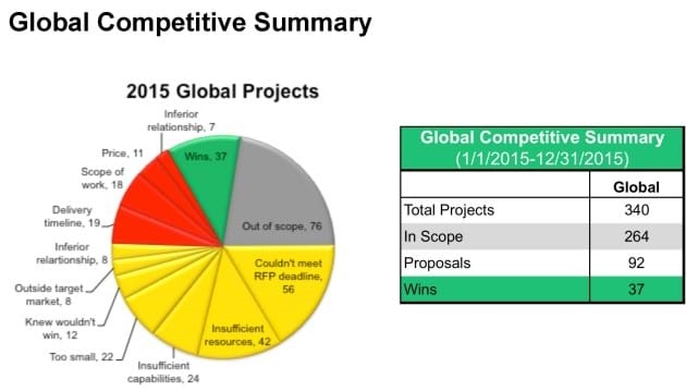
In connecting the dots, Cole gives a real-world example of a pie chart accompanied by a table.

She goes into more detail on her blog post (linked above), but her assumption was this graph was from a firm that submits proposals for potential projects. They are analyzing their metrics from the past year to better inform them how to increase their work in the coming year. They specifically want to better understand the projects where they either don’t submit a proposal or didn’t win the work.
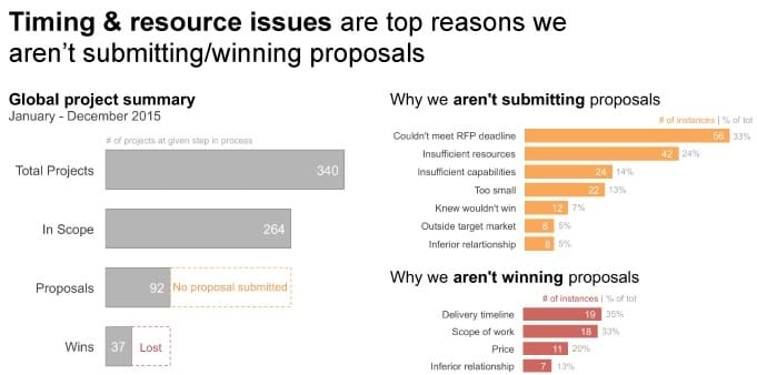
Cole’s singular goal was to show the information in a way that makes it clear how the data in the pie and the data in the table are related. The information is in the original graphic, but it takes some work for the reader to figure that out. Cole takes the guesswork out with her revised graphic. In other words, the new graphic connects the dots for the audience.

Specific changes in the new graphic include:
- The title has changed from a generic “2016 Global Projects” to a possible take-away
- Dotted lines on the left bar graph clearly illustrate the missed opportunities
- The orange dotted lines on the left bar graph (No proposals submitted) is directly related to the orange bar graph on the upper right, which details why proposals aren’t being submitted
- The red dotted lines on the left bar graph (Lost) is directly related to the red bar graph on the lower right, which details why proposals aren’t won
With simple bar graphs and just three colors, the new graphic is incredibly powerful. It leads the reader through the story; from the title (top reasons we aren’t winning), to the Global project summary (counts between January – December 2015), to the missed opportunities (dotted lines), to the reasons those opportunities were missed (orange and red graphs). Which neatly circles back to the title, “Timing & resource issues are top reasons we aren’t submitting/winning proposals”.
Cole’s example is deceptively simple. It seems obvious when looking at the before and after graphs, but the difference is powerful when viewing both of them. Her simpler graph frees the reader from trying to figure out the message. With dots fully connected, the reader can move forward with the story and start pondering solutions – like how to address the timing and resource issues.
Effective story telling through data visualization connects the dots for your audience. With the right time and thought given to layout, colors and messaging, you can fully realize the power of a good graphic.
