Semantic Versioning in Azure DevOps: Automating Version Management with semantic-release-ado
July 09, 2026

Improve Your Mapping In Power BI
*Updated 8/12/2020
Mapping Introduction
On the surface, mapping in Power BI may seem like one of the weaker aspects of Microsoft’s Business Intelligence solution. There are, however, several hidden techniques that can be used to vastly improve the mapping capabilities in Power BI. Upon a fresh install Power BI Desktop, the application used to develop Power BI reports, there are three mapping-related visualizations. Map, Filled Map, and the ArcGIS Map by Esri. There is a fourth visual called Shape Map that at the time of this writing has been in preview for the past several years. To enable the fourth map, navigate to File -> Options -> Preview Features and select Shape Map. Each map visual offers slightly different features and capabilities that can confuse users who are new to mapping in Power BI. Beyond these four map visuals, there are also several notable visuals offered in the custom visual marketplace.
Avoid Mapping Pitfalls
No matter what visual type you select, there are some common instances that can weaken your reports such as inaccurate data and data sampling issues. Inaccurate data can arise from generic values such as city names, which can be the same across multiple US states or multiple countries and not display as intended. One method to handle inaccuracies is to ensure the data category has been selected for each field from the Column Tools tab. Once done, a globe icon will appear next to the field in the sidebar. Data sampling issues typically arise from having too many values for the visual to render. Each visual has a different render limit. Limits can be handled by using hierarchies for the data such as displaying only states, then adding a drill-through to cities option, and more if needed. It is important to note that using drill-through on hierarchies is not supported in all mapping visuals, however. The specific features and limitations of each mapping visual are outlined below.
Map Visual
Key features
- Displays points
- Auto Zoom
- Street View
- 3,500 data point limit
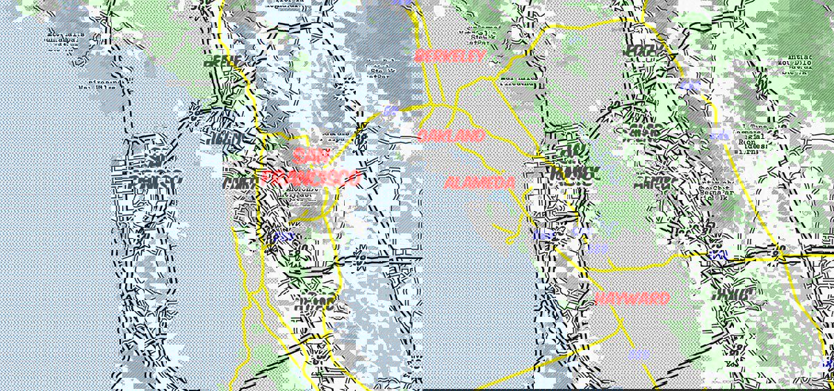
The very descriptively named, Map visual uses Bing Maps to plot bubbles or a heat map of the provided data. The size of the bubbles can be changed based on a data point as well. A useful formatting option is Auto Zoom, which will zoom the map specifically to the provided data rather than showing a world map that the users must navigate around. There are several different themes available or base maps to choose from. One notable downside of this visual is the data size limitation of 3,500 data points. If more than 3,500 values are added to the visual, Power BI will take a sample of the data and only plot the values it has selected. This may not be ideal for every dataset. An often-unknown feature of this visual is the included street map. In addition to supporting drill-through, drilldown, and report page tooltips, the Map visual has Bing street maps. By zooming all the way to a specific street, a blue line will appear. Double clicking on this blue line will activate the street level view.
The Street level view of the Map visual
Filled Map
Key features
- Displays boundaries
- Auto Zoom
- 10,000 data point limit
The filled map is a choropleth map, meaning it shows various color-coded regions. This visual uses built-in geographic boundaries, such as country, state, city, and zip code. For data related to the United States, this is very useful. Unfortunately for other parts of the world, this level of granularity may not be sufficient. For example, a dataset specifying various boroughs in London will only drill down as far as the United Kingdom. Luckily, there are other visuals such as the Shape Map and ArcGIS Maphave this capability. The data size limit of 10,000 data points is much larger than the Map visual because it renders boundaries instead of points. This ensures that much more of the data is accurately captured for large datasets.
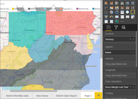
A Filled Map visual showing various US states
Shape Map
Key features
- Displays boundaries
- Custom boundaries
- 1,500 data point limit
The Shape Map is similar to the Filled Map; it is another choropleth map that relays filled in boundary data. This visual however, allows the user to specify their own boundaries. One suspected reason this visual remains in preview after so long is the potential for lower performance related to loading custom shape files. The visual may render more slowly depending on the processing capabilities of your computer. There is also no underlying street map and a smaller data size limitation of 1,500 data points. Beyond those limitations, this visual offers an excellent way to show custom mapping data. The Shape Map can load any file using the TopoJSON format. There is an excellent tool at mapshaper.org that can edit your mapping files and even convert them to various formats including TopoJSON. Another useful feature of this site is simplifying the file by shrinking the file size and complexity of the boundary lines so it can render much faster in Power BI. There is also a GitHub repository that contains TopoJSON files of countries specifically for the Shape Map in Power BI.
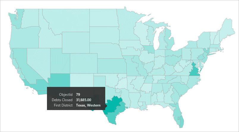
A Shape Map visual displaying the US Judicial districts
ArcGIS Map for Power BI
Key features
- Displays points, boundaries, and heatmaps
- Base maps
- Reference layers
- Infographics
- Premium features available
- 30,000 data point limit
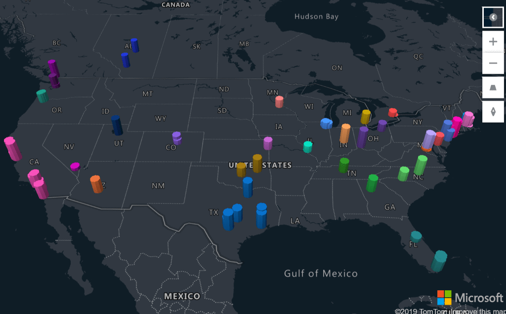
This visual uses maps created by Esri, one of the leading organizations in geospatial mapping. It has so many features that we could easily dedicate an entire blog post to it. Many of the features are free to use but even more can be unlocked by linking an existing ArcGIS Enterprise or ArcGIS Online account. The Esri Plus subscription for premium Power BI content has been discontinued. Connecting an account allows you to use exiting content such as base maps and reference layers from your organization. The free version has plenty to offer as well, for example you can create bubble maps, shape maps, and heat maps. In addition, there are four different base maps to choose from, and you can add custom pins to the map to display a fixed location. The Drive Time feature adds a radius based on the time selected to show all the places you can drive to from a specific location. There are many reference layers available to add that are taken from the ArcGIS site or demographic data from the US Census. In a March 2020 update, multiple reference layers can be added to one visual. There are also Infographics which can show US Census data off to the side of the map, filtered down to exactly what area has been filtered to in the map. One important note is that these customization options do not appear in the filter pane as in every other visual. They can be found by clicking the three dots at the top right of the visual and selecting Edit. The ArcGIS map can support up to 30,000 concurrent data points. At the time of this writing, the ArcGIS visual is not supported in Power BI Report Server and does not support drill through, drilldown, or report page tool tips.
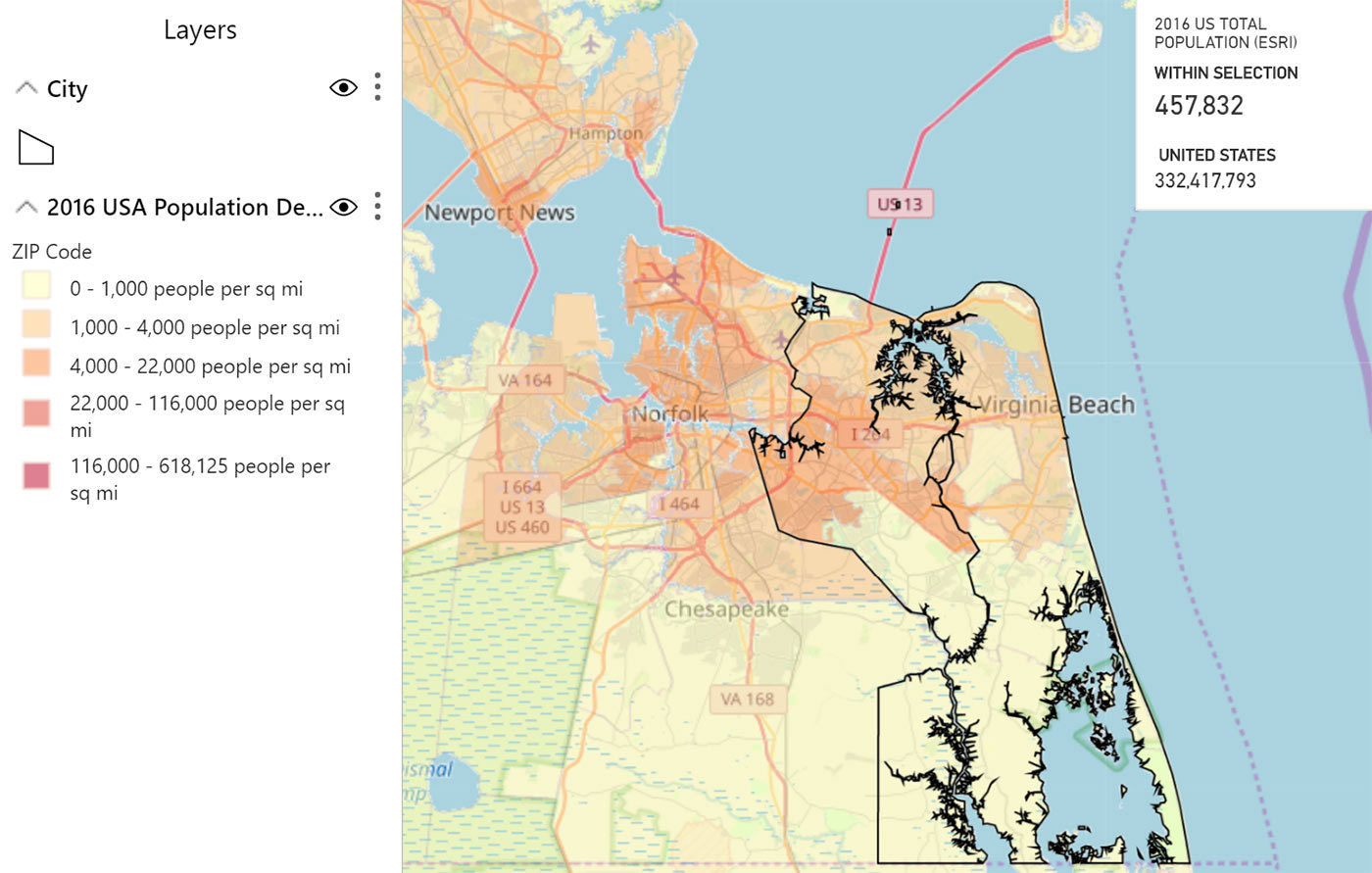
Population density and total population using a city as a data point with the ArcGIS visual
Mapbox
Key features
- Displays points, boundaries, and heatmaps
- Fully customizable base maps
- 3D bars on a globe
- Premium features available
- 30,000 data point limit
Mapbox is a custom visual that can be added from the marketplace. It requires an API key for use which can be obtained for free from Mapbox. Once registered, you can access the Mapbox studio which is an online designer for base maps and more. You can create fully customized maps or use ones that have been created by other users. Mapbox visuals use the GeoJSON format, not TopoJSON as before. Use the resource mentioned above to convert an imported layer as needed. You can use on premise layers that are tied to a premium Mapbox account. This visual also supports publishing to Power BI Report Server and publish to web, as well as drilldown, drill-through and report page tool tips. In addition to points, boundaries, and heatmaps, it can also display 3D bars on points to show quantities and heights in a unique format. Mapbox visuals render up to 30,000 data points.
A custom base map that looks like a comic book from the Mapbox visual
Icon Map
Key features
- Displays points, boundaries, and heatmaps
- Base maps
- Reference layers
- Custom images
- Live weather layers
- 1,500 data point limit
The Icon Map is another custom visual that can be added from the marketplace. It supports many of the same features as the other maps but can display data points as circles, lines, or images. Rotations can also be assigned to the icon. One use case for this is an airplane image with a rotation based on the direction of the plane. Icon Map has several built-in base maps and supports using some from Mapbox if an API key is provided. It also has reference layers to show the current daylight curve, cloud coverage, wind, or precipitation. The weather layers feature live data from openweathermap.org if an API key is provided. Like the Mapbox API key, the OpenWeather API key is granted after creating a free account. The Icon Map visual renders up to 30,000 data points.
Real-time weather data using the Icon Map visual
Azure Maps
Key features
- Pan, zoom, rotate and pitch
- 7 map styles
- Data layers such as bubble and 3D bar chart
- Reference layers such as a custom file or real-time traffic
- 30,000 data point limit
A new visual announced as a preview feature in July 2020 is powered by Azure using TomTom maps. It requires latitude and longitude fields to work but includes many new ways to display location data. The layers available are bubble, 3D bar chart, reference, custom tiles, and real-time traffic. The pitch alignment offers a great way to freshen up maps that have always had a flat, bird’s eye view.
A 3D bar chart from the Azure Maps visual with the pitch aligned at an angle
Honorable Mentions
There are several other custom visuals that have more specific use cases and are worth noting. The Flow Map visual uses the Bing Maps API and shows the movement of objects between places. The Route Map and Flow Map visuals are created by the same author and are useful for vehicles and planes as they are traveling along a route. The Globe Data Bars and Globe Map visuals show bars on a rotatable globe. The Drilldown Choropleth and Drilldown Cartogram visuals are similar to the Map and Filled Map visuals but add drill through capabilities. These two were created by other teams within Microsoft. Lastly, the Synoptic Panel by OK Viz is an award-winning visual that supports custom maps such as floor plans, the periodic table, basketball courts, and anything else you can design in addition to geographic maps.
Wrap Up
Power BI may seem to have limited mapping capabilities on the surface, but there are a variety of options to make incredible maps within the tool. It is important to note the differences of each when selecting the type of visual to use. There may be a specific visual or combination of visuals that will offer the experience you need to explore your data. Avoid mapping pitfalls such as ambiguous data points and sampling of values. Be sure to explore the custom visuals offered in the marketplace for even more mapping options.

Brian KnoxCore Contributor
Business Analyst
Brian Knox is a Senior Data Solutions Consultant and Team Lead at Marathon Consulting and is a Microsoft Certified Power BI Data Analyst Associate. Brian has worked with clients as a Power BI developer, administrator, and instructor for over 8 years. He is a graduate from the College of William and Mary, having completed the inaugural class of the Master of Science in Business Analytics program. He has an undergraduate degree in information science from Christopher Newport University. Brian learned early on that he wanted to combine his passions of business and technology. Brian loves all things data and is always looking for ways to share his data science knowledge to help others throughout Hampton Roads.