Level Up Your Note-Taking with LLMs
October 09, 2025

Landing Page Essentials and How to Design One That Converts
What is a Landing Page?
A landing page is a web page created to be the first page a visitor sees when they follow a link from things like a promotional ad, Google results, social media content, etc. However, landing pages are more than a place to land. They often have a goal in mind: to convert the user into taking an action. Some examples of this conversion could be the user signing up for something, gaining user information such as name and email address, or even clicking a button that moves the visitor to shop.
Marketing guru Neil Patel said it best: “A landing page is a good way of directing visitors to what they are looking for instead of leaving them to look for what they want around your website.”
Preparing for Design
Information Scent - What it is and Why it is Important
Information scent is a trail of information that remains consistent from one channel to the next, indicating to a user that they are on the right path. Strong information scent is achieved through consistent design and messaging across all channels of your campaign. This is similar to how the scent of food can guide an animal to their next meal; information scent can guide a potential customer to the information they are looking for.
Weak/No information scent can cause setbacks and frustrations for the user:
- They can have trouble finding the content they are looking for.
- They can spend a longer time evaluating the options they have.
- There is an increased chance that they will select the wrong option, forcing them to click the back button or, even worse, leave your page.
Defining the Goals
When creating a landing page, one of the most important first steps before actual design is to identify and understand the goals for the page. Without understanding the goals, you have a much higher chance of missing out on converting users and decreasing traffic to your website. The two types of goals to focus on are:
- Business goals
- Audience goals
Business Goals
The overarching goal for any landing page is to focus an entire page of your website on driving a person to perform a specific action with limited distractions. By selecting two to three goals, you can better focus your strategy for the landing page to best suit reaching those objectives.
Examples of landing page goals:
- Increased subscriber conversions
- Successful upsells or cross-sells
- Engagement on social media
- Growth in revenue
- Video views
- Inbound goals
- Generating downloads
Audience Goals
Understanding the goals of your audience is an important step in designing a landing page. Without knowing your audience, you might end up putting effort in all the wrong places. Three ways of learning more about your audience are to:
- Create a detailed target audience persona.
- Talk to and survey them.
- Research the competition.
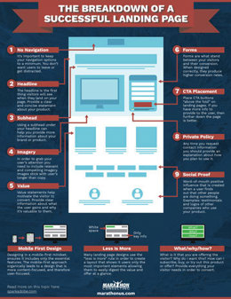
The Breakdown of a Successful Landing Page
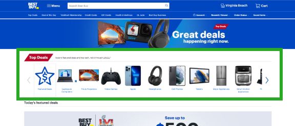
Navigation or No Navigation – When to Use Which One
A landing page usually has one goal in mind: conversion. While having navigation on your landing page can distract the visitor and give them a way to exit, there are cases when it makes sense to add some type of navigation to your design.
When to include navigation:
- When there are multiple goals. Visitors who aren’t interested in your goal of the landing page may be interested in other services your company offers.
- When you want to allow the user to visit your Contact or About page to learn more about the company and help gain trust.
- When you are providing social links to allow visitors to share your landing page and increase your social outreach.
- When it navigates the user within the one page and optimizes their experience.
When not to include navigation:
- When your focus is on one and only one goal. Don’t give your users exit links if your only goal is the goal of the landing page.
- While using PPC marketing. When you have a lower chance of conversion, you also have a higher chance of losing money on your pay-per-click advertising.
Headline
The headline is the very first thing your visitors see when they land on your page, so you want to be as engaging as possible to avoid any bounces. Here are some key things to remember when creating a headline for your landing page that provides a great first impression:
- Be clear and concise.
- Provide as much information about your product or offer as possible.
- Keep it relevant.
- Try to empathize with the user’s problem.
Subheading
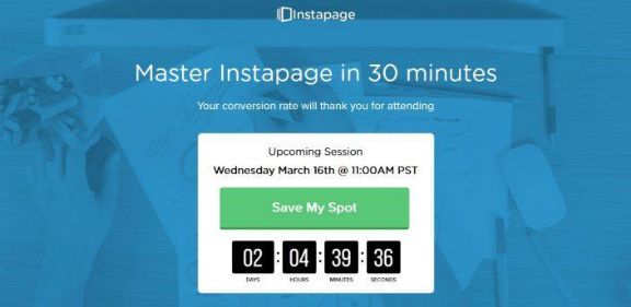
Using a subhead under your headline can help you provide more information about your brand or product. Consider this your page's value proposition of why your offer stands above all the rest or why your service or product is useful. They also help guide the reader down the page if they are scanning.
Imagery
To grab your user’s attention, not only do you need a great headline, but you also need to include relevant and compelling imagery. Images stick with users longer than copy and help to reinforce the statement and messaging you are trying to market. Examples of useful imagery are:
- Photos of products
- Images of the company and team
Value
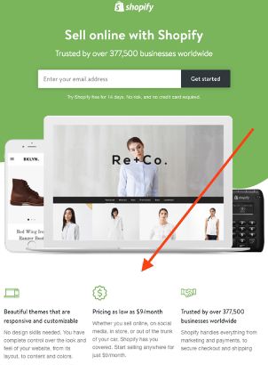
Adding a value statement about the offer, product, or service you are marketing can help draw the visitor’s eyes to the key takeaways and show them what sets you apart from the competition. In turn, this motivates the visitor to convert. Providing clear information about what the user gains from the offer and why it is valuable to them can make all the difference.
Forms
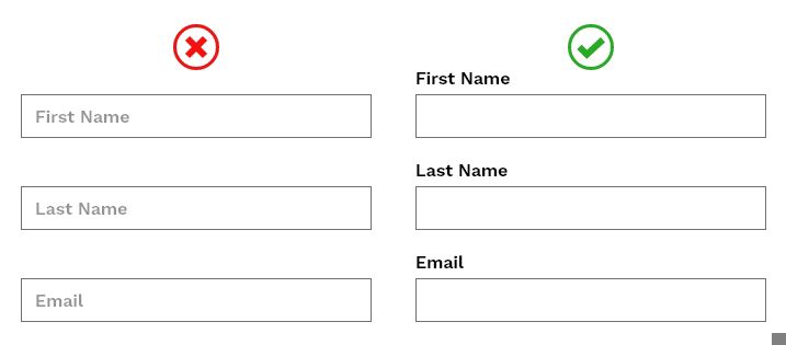
Forms can be what stand between your visitors and their conversion. They are the digital bridge between you and the user and, when designed correctly, produce higher conversion rates. Good practices of creating user-friendly forms include:
- Collecting only what is necessary
- Using clear and concise form field titles
- Using a single column and left justifying
- Utilizing validation
- Using smart forms technology
- Including info boxes
Buttons
Several factors play significant roles in success when it comes to call to action buttons:
- Wording - use clear and concise wording that describes what your user will be getting. Instead of saying “Sign Up,” say “Get a Free Trial.”
- Size and Shape - You want your user to clearly see the CTA button, but make it too big and it draws their eyes away from other important content. Also ensure the button looks like an actual button.
- Color - Use contrast and color complementation to make your button stand out. This could also depend on the type of product or service you offer.
- Font - Use consistent fonts that are sized big enough on the button to stand out but not clash with the rest of the of the page.
Privacy Policy
Users today must worry about what a company is going to do with the information they provided when signing up for a service or offer. Some shady businesses will take information such as email addresses and phone numbers and sell them. Providing a short statement on your privacy policy can help gain trust with your users and, in return, increase conversions.
Social Proof
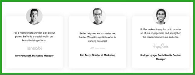
Social proof is a word-of-mouth positive influence that is created when a user finds out that other people are doing something. If someone sees that a bunch of other companies are using a product, that person than gains trust in the product and will be much more likely to convert. According to a report from Nielsen, 70% of people will trust a review from someone they’ve never even met. Some examples of social proof are:
- Testimonials
- Numbers
- Social posts
Credibility
Your online credibility increases when you create landing pages that answer your visitors’ specific needs or problems. The reason for this is that as you provide a solution to your visitor’s underlying problem, your potential customers begin to trust you. They begin to see your website as something that they can trust and provide them with a valuable solution.
As your customers start to believe in what you offer and in your brand, it will also allow you to begin establishing your online leadership and authority.
Basic Practices and Principles for Landing Pages
Less Is More
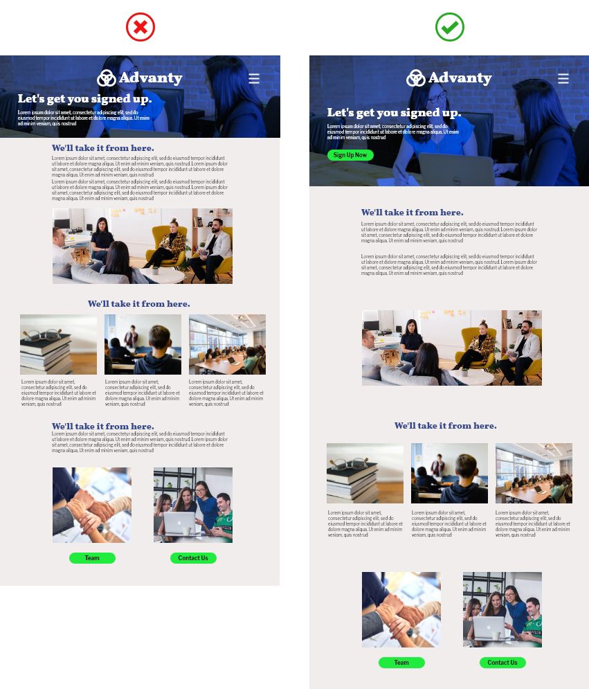
Many landing page designs use the “less is more” rule to create a layout that shows the users only the most important elements, allowing them to easily digest the value and offer at a glance. This helps avoid the experience of information overload.
Use Plenty of White Space
Using whitespace, or blank space, between your elements helps to keep your landing page from looking too cluttered and helps highlight the most important sections of your page. It enhances a page’s readability and establishes a visual hierarchy. Having a cluttered page can confuse and overwhelm your visitors and will produce a frustrating experience, encouraging many users to leave your page without converting.
Pre-Populate Cursors
One of the quickest tricks to implement into your landing page design is by pre-populating the cursor to the first form field. Guiding the user in this simple way can help reduce friction and helps to create a higher rate of conversion.
What/Why/How
An important practice in creating a landing page is following the “what/why/how” format to provide everything your visitor needs to convert.
- What – What is it that you are offering the visitor?
- Why – What value does this offer to the visitor?
- How – How can I subscribe, buy, or try out this product or offer?
Conclusion
Landing pages are great tools to have when trying to convert a website visitor into a customer, whether that is by selling them a product or simply getting them to sign up for a newsletter. When creating a landing page, decide what your overall goal is and incorporate some of the elements you just read about into the design. If the goals aren’t being achieved, it’s much easier to tweak and test out different strategies with a landing page than it is with your entire website.
Download the Landing Page Essentials Infographic
Here's an infographic I created to show the breakdown of various components and best practices used in successful landing page designs.
