Level Up Your Note-Taking with LLMs
October 09, 2025

UX Design – What Video Games, Web Design, and Mobile App Design have in Common: Part 2
Part 2: Interfaces and Empathy
I’ve been playing video games throughout my entire life. As a child, the moment I held a Nintendo Entertainment System controller, I couldn’t put it down. Several decades later, I still find myself engrossed in the story and challenge of playing a game. There is nothing quite like the satisfaction of completing that difficult level you were stuck on for days or finally beating an entire game that you’ve spent months trying to complete.
As my love for games grew, so did my curiosity in the creative design of a user's experience and the player interface. I began to wonder what the process looked like to design a game that created a great experience for a player. What went into a game that looked great, was easy to use, engaging, and made the players fall in love with it? These are, after all, the paramount aspects of a game's success. I have found by having a great user interface and designing for the players through use of empathy, you provide yourself the cornerstones of a great gaming experience.

Player Interfaces
When thinking of a game's interface, most people only think of the things they see placed around the screen such as a health bar, number of lives, ammo count, etc. However, there are four different types of interfaces that games incorporate into their overall user experience: non-diegetic, diegetic, meta, and spatial.

Non-Diegetic
Non-Diegetic is the type of interface that first comes to mind for most people. The visuals are overlaid on top of the game and are not a part of the game's story. Non-Diegetic UIs can be made up of health and ammo or be a hotbar like in Age of Empires II.

Diegetic
Diegetic exists in the game world instead of being overlaid on top. The visual display is a part of the game’s story and the characters in the game are aware of its presence. A good example of this is in the Fallout 3 and 4 games where the character has a Pipboy device on their arm that they use to view their inventory and map. Games like Metroid also use this type of interface to display info on the face shield of the armor suit your character wears.

Meta
Meta UIs are like Non-Diegetic UIs, the typically 2D visual display is a part of the game’s story but, it is not recognized by the character as being a visual element. A great example is Call of Duty: the health bar is replaced in part by the thickness of blood splashing on the HUD and obscuring your view. The in-game character then wipes their eyes trying to clear their vision.

Spatial
Spatial UIs consist of elements within the game’s 3D space but are not part of the game’s story. So, while you see the visuals, the in-game characters do not see them. Most of the time, this type of interface is used to guide the player or assist them while playing. An example of this type of UI is in Legend of Zelda: Breath of the Wild where the enemies have arrows over their head to let the player know which one your character is focusing on. Another example is the guiding lines on the racetrack in games like Forza.

Guidelines for Interface Design
While these types of interfaces are specific to the gaming industry, the key principles for interface design are similar when designing for the web and digital applications. Consistency, user familiarity, and recoverability are a few of the most important guidelines when creating an interface for a product's users.
Consistency
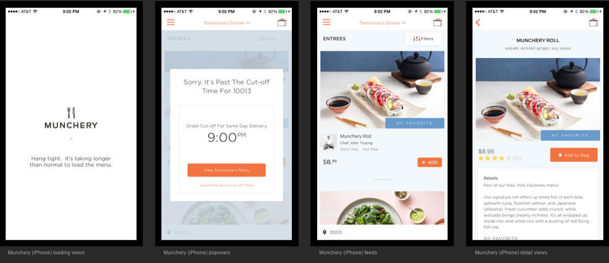
Consistent design throughout your video game or website is a key principle to successful interface design. Using the same patterns, shapes, styles, and colors in your design and ensuring they behave in a uniform way, validates a user’s assumptions about the interface, creating a sense of control and reliability. Consistency in your design improves usability and eliminates confusion for your users.
Familiarity
Using terms, icons, and other elements that the user is already familiar with can make a product much easier to use. Even if a user is new to the game or is visiting a website for the first time, using familiar elements will allow your audience to easily navigate the product. In a world where people want to get things done quickly, using the familiarity guideline while designing an interface can help reduce the learning curve, increase user retention, and improve usage speed for your users.

Recoverability
Users are inevitably going to make mistakes when using a product. This is why keeping the principle of recoverability in mind when designing an interface is important. Eliminating mistakes can never fully be achieved, but with a good interface, it can be minimized. You should include interface elements that allow users to recover from their mistakes such as undo options and requesting confirmation for destructive actions.

Empathizing with the Users
One of the fundamentals of user experience in a video game and web design is making sure that the user is going to experience the product the way it was designed and intended. To develop an experience that doesn’t get frustrating or boring is the ultimate goal of a designer. Some of the most effective user experience designs are successful in keeping a user interested throughout the entirety of the experience and keeping them immersed within that environment.
Keeping the User Interested and Immersed
A game should be designed in a way that captures the player’s interest and holds that interest throughout the entire intended experience. There are tons of in-game elements that designers create to accomplish this.
The three that have always stood out for me in video games are:
- Leveling up your character
- Having objectives or quests to complete
- Finding good loot
Leveling up an in-game character is a great way to keep a player interested and involved. Giving them the ability to work towards getting that new perk or increasing their character’s abilities can become an addictive feeling that keeps a player engaged and playing. It makes the player feel like they’re accomplishing something and that all their hard work is paying off. The same goes for completing quests or objectives within a game. If you’re anything like me, then you get excited at the chance to check things off a to-do list. Not only are the quests fun and satisfying, but they provide the player with direction and something to do. Finding loot (or prizes) can also be an exciting aspect of games. It’s a pleasant surprise to get a legendary item or some top-level gear for your character. In the web world, it is akin to “delightful” experiences and “Easter eggs”.

One of the best techniques in designing for a user is to think about the immersive quality it provides them. When people play video games, they usually want to leave the real world behind and enter another. A great way to provide this immersion is by using spatial presence. By providing a spatial presence, which is defined as existing when "media contents are perceived as ‘real' in the sense that media users experience a sensation of being spatially located in the mediated environment," the player will feel like he/she is actually “there”.

Where games use these types of elements in their design to keep their users having fun and entertained, websites and mobile applications use several principles and guidelines to keep people on their website longer. The longer a user spends on your website, the higher the chance for them to remember, trust, and buy something from you. Having a high bounce rate is a clear indication that something is causing a bad user experience on your site.
Some of the many ways designers avoid a high bounce rate is by having:
- Clear and easy to understand navigation
- Clean and scannable content
- Optimized images and elements for fast page load times
- Providing value to your target audience
- Relevant and up-to-date content
A designer utilizing these simple but very important principles can create a much more immersive product that keeps their users interested in what they’re being offered. A great user experience builds credibility and trust which in return will ensure your users will return time and time again.
Conclusion
While we’ve only touched on a few of the many aspects of UX/UI design within the digital world, it’s easy to see that by keeping accessibility in mind, creating a user-friendly interface, and using empathy to design for your audience, a digital product can become an amazing experience. With new opportunities to create more captivating elements, I’m excited to see what the future holds for the design community. As a designer and a video game enthusiast, there is no better time to be alive!
Check out part 1 of this series where we take a look at accessibility.
