UX-Led Modernization: Turning an Umbraco Upgrade into a Friction-Free, Enhanced Online Banking Experience
 First Commonwealth Bank was founded as a community bank serving Western Pennsylvania in 1982. Today, they have over 120 locations serving customers in 30 counties throughout Pennsylvania and Ohio and provides a full range of commercial and retail banking services, including mortgage, wealth management and insurance solutions, along with equipment financing, and SBA and indirect lending.
Project
An Umbraco upgrade created the ideal opportunity to take a deeper look at First Commonwealth Bank's digital experience. Through a comprehensive UX audit, we uncovered key opportunities to improve usability and functionality. Supported by the UX-based redesign, the Umbraco upgrade enhanced security, scalability, and flexibility while delivering a faster, more intuitive online banking experience for customers.
Challenge
First Commonwealth Bank supports a diverse audience through its website, from individuals opening their first checking account to business owners managing payments and receivables. Although their site offered robust content and functionality, the experience was creating unintended friction at critical decision-making moments. Complex navigation, unclear login pathways, and difficult-to-use comparison tools made it harder for users to confidently complete key tasks — introducing frustration, slowing conversions, and placing unnecessary strain on both customers and internal support teams.
Solution
Our approach began with a user-centered journey analysis, mapping real-world scenarios based on how customers typically entered the site and the tasks they were trying to complete. Evaluating the experience through these journeys allowed us to see the platform from the customer’s perspective and uncover key points of confusion, hesitation, and drop-off. Guided by these insights, we identified the most critical pages and components and conducted a comprehensive UX and UI audit across desktop and mobile, using established usability principles and industry best practices as our evaluation framework. Each finding was translated into clear, prioritized recommendations designed to improve clarity, ease of use, and task completion, directly shaping the UX strategy that guided the redesign during the Umbraco upgrade.
Results
Guided by insights from the UX audit, the redesign focused on removing friction at critical moments — when users were trying to find information, access their accounts, or compare financial products. Our strategy emphasized simplifying pathways, improving clarity, and creating more intuitive interactions across devices. The examples below highlight several high-impact enhancements delivered as part of a broader set of UX and functionality improvements during the CMS upgrade.
Navigation was a major barrier to task completion. The original mega menu presented too many choices at once, making it hard for users to decide where to go. We reorganized the navigation into clearer, customer-focused categories — such as Bank, Borrow, Invest, and Protect — that better aligned with user expectations. Each category now leads to more focused submenus, helping users reach key content faster. This streamlined structure was also applied to mobile for a more consistent experience.

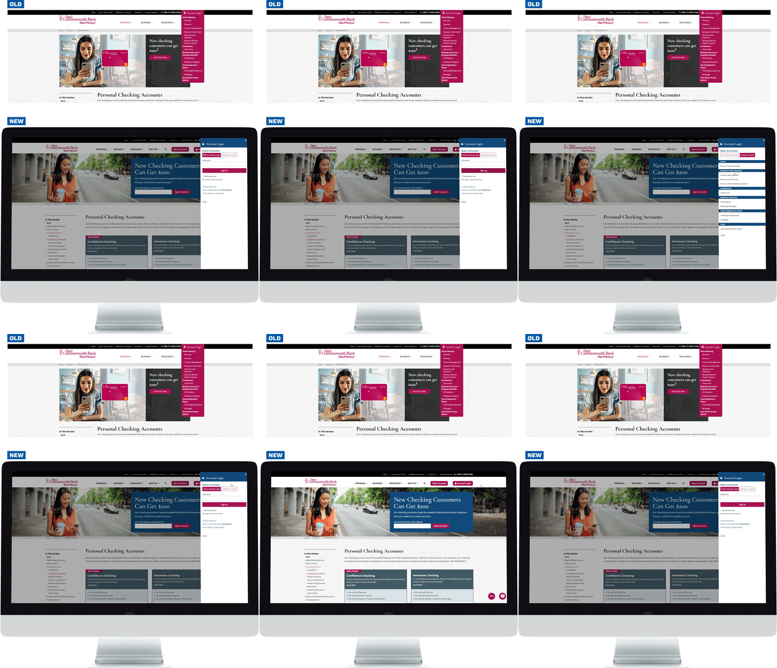
Account access was another key pain point. Previously, only Online Banking appeared in the main login modal, while other portals were scattered throughout the site. This forced users to search for the correct entry point. We redesigned the login experience to centralize all portals in one easy-to-scan interface, allowing users to quickly and confidently access the right system.

We also improved how users evaluate financial products. The original comparison tables were difficult to use — especially on mobile — where information was cut off and context was easily lost. The new responsive comparison experience improves clarity across devices, with better sticky headers on desktop and a mobile-friendly layout that eliminates awkward horizontal scrolling.
Finally, we enhanced product overview pages to support faster decision-making. Account option cards were redesigned to surface key details like fees and benefits more prominently, using clearer visual hierarchy and more scannable layouts. With essential information easier to find, users can compare options and move forward with greater confidence.
Together, these improvements created a more intuitive and confidence-building digital experience, supporting higher task completion and smoother journeys across key customer interactions.
Conclusion
Rooted in real customer journeys, the UX audit informed targeted design and functionality enhancements that eased friction across essential banking tasks. The refreshed experience is more intuitive, accessible, and SEO-friendly, with full ADA compliance and stronger alignment to both user needs and business goals. Following approval, the high-fidelity designs were implemented as part of the Umbraco upgrade, resulting in improved security, faster performance, and greater scalability — all supported by a flexible, future-ready foundation for continued growth.
Features
- Human-centered, brand-aligned design
- Simplified global navigation
- Responsive forms
- Modular page templates
- Customizable campaign landing pages
- Improved site search
- ADA compliance
- Live chat for real-time support
- Third-party service integrations


