Level Up Your Note-Taking with LLMs
October 09, 2025

UX Design – What Video Games, Web Design, and Mobile App Design have in Common: Part 1
Part 1: Accessibility Design
Video games need to be designed in a way that avoids unnecessary roadblocks for those with disabilities or impairments. A good game design is a design that can be used by everyone, and like games, every digital product should provide its users with equal access to its intended experience. No user should be penalized for their disability. Whether it’s a user or player who has multiple sclerosis, is deaf, or has a temporarily broken arm, having good accessibility design opens up the experience of your game, website, or mobile application to a much wider audience.
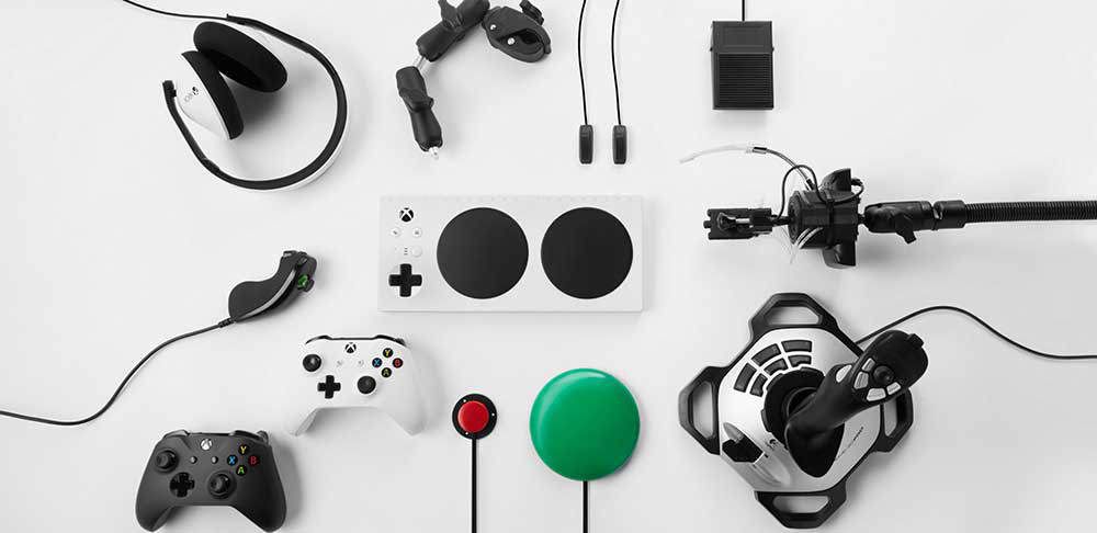
Accessibility in design not only helps those with disabilities, but it helps everyone. I still find myself using subtitles to help pick up on things my ears might have missed. I remap keys on my keyboard to accommodate my style of game playing. Below I want to briefly touch on a few accessibility design practices within the gaming industry and how they relate to ones used in web design.
Motor Disabilities
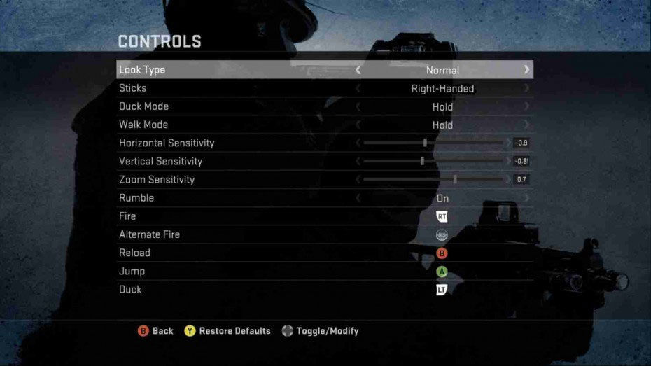
People with motor disabilities such as cerebral palsy or post-stroke victims benefit greatly from accessibility design in video games. Remapping of buttons on a keyboard or controller allows players with these types of conditions to easily change the configuration to support their needs. This gives them the ability to better reach essential controls. Designers have been taking this type of accessibility into thought more often, even changing the in-game prompts during the onboarding tutorial to match that of the custom mapping to prevent any confusion or frustration for the player once they get into the game.
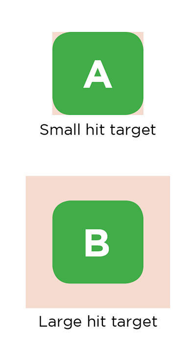
In terms of web design, a user with motor disabilities can have a frustrating experience trying to navigate a site or application. One way to avoid issues is by ensuring that interactive objects within the design have large image maps to allow users to easily click the button without precise cursor positioning. No one has a good time clicking a tiny button 25 times before it actually registers. By making the hotspot a bit bigger than the button itself you make it easier for a user to interact with it.
Also, making sure a user has the ability to navigate a website's links through the use of a keyboard is great accessibility design. Some users don’t have the option to use a mouse because of their disability and will need to use the keyboard to interact with the product. Without this option, even the best designed website becomes unusable for this audience.
Color Blindness
Video games tend to use color to help communicate information to players, whether it’s to tell you what team you are on or distinguishing important items from less important ones. This can become a frustrating experience for players who have color blindness to the point where some games are completely unplayable. The 3 most common types of color blindness are protanopia, deuteranopia, and tritanopia. These impairments can make blues look like purples, greens look like browns, or even reds look like black.
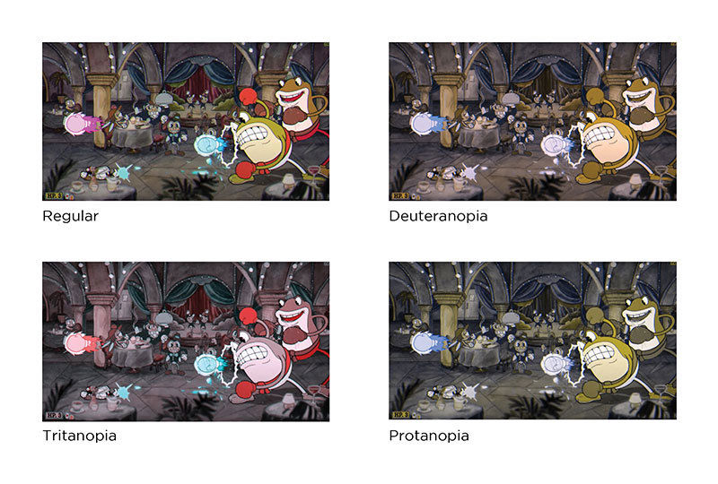
Game and web designers need to consider two things when designing for visually impaired audiences. First, good contrast is a great way to help distinguish two items apart. Second, and most importantly, color should always be used as a backup means of communication instead of the default way to represent meaning. Things like shapes, animations, or text should be used first as signifiers.
More games these days have taken into consideration these types of players and provide customization that assists those who are color blind. Destiny, a popular online-only multiplayer first-person shooter video game developed by Bungie, is a great example of accessibility design for visually impaired players. They provide options to change the user interface element colors in-game to a set of colors depending on what type of color blindness the player has while also showing a sample of the palette. (Photo 5)
Hearing Impairments
Sound in video games has always been an important element that evokes and sets a type of mood and provides a specific experience for the player. More essential parts of the game such as character conversations or enemy locations need to be considered for not only players who suffer hearing loss but also those with noisy environments, or even those keeping the volume on mute to avoid waking up other family members who might be sleeping. Designers use elements such as subtitles as an obvious solution and providing customization for those subtitles adds that extra little touch of accessibility. Some go even deeper using visual signals as an awareness indicator letting the player know which direction the sound or enemy is coming from. The Last of Us II provides both elements in their game showing that a little bit of thought and creativity can make a game much more accessible to its players.
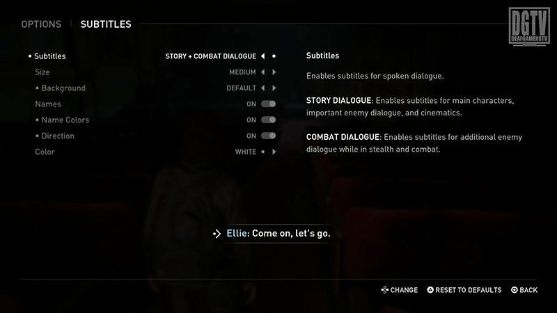
Designers who design for the web also must keep these important guidelines in mind. Many websites use videos and audio presentations in their designs to convey important information. Including visual text transcripts and closed-captioning subtitles opens up the ability to engage with the hearing impaired community. Taking the goal of engagement even further, web designers should ensure that there are a variety of ways for a user to get in contact. For example, while having the option to contact via phone call, also make sure to provide options such as email, or live webchat for your audience.
Difficulty
It’s hard to put the difficulty of a video game into specific categories. What is extremely hard for one player might be slightly easy for another. In terms of UX design, it’s okay to make a game hard as long as it’s not unfair. Game designers have begun experimenting with difficulty options, other than the typical easy, normal, and hard modes, to allow games to be more accessible for all players, whether they want a game that is relaxing or extremely challenging.
A great example is the game, Celeste. Celeste is a beautifully designed platform game with a great story but is also known to be very difficult and can take many hours to master. The developers that worked on Celeste kept accessibility in mind when designing the game and provided an assist mode that allows players to tweak the difficulty in several ways. Is the game going too fast? Try turning the game down to 75% speed. Do you hate having a time limit on how long you can grip a wall or how many air dashes you’re allowed? Try turning on infinite stamina or increasing the number of dashes your character has.
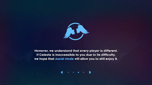

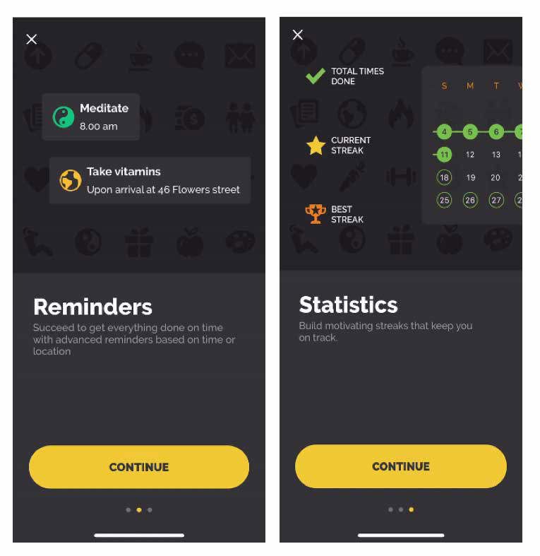
These types of options are similar to those in web design such as the tooltips and onboarding tutorials. Providing extra info on complicated form fields or guiding the user through a tour of how your application works are the little things that can increase the likelihood that a user will have a good experience interacting with your product.

Conclusion
These are just a few of the many things that need to be considered in terms of making your digital product more accessible to the users, whether they are within your target demographic or not. Having these types of designs can help make a game enjoyable for many more people, boost the SEO of your website, or allow an application to be used as it was intended. Questions need to be asked throughout the design process to allow the designer to create a more accessible user experience.
Check out part 2 of this series where we take a look at user interfaces and empathy.
